
The Tab Panel is a control that ensures only one of its children is visible at a time. It creates a button for each child that controls which child is visible – clicking one of these buttons will show the child that is associated with it while hiding all other children. There is some required setup to use a LayoutTabPanel. There is a prefab named “TabButton” that is a LayoutButton, the Font and Background need to be set or the buttons will not display.
The LayoutTabPanel prefab will have one child to start with called “TabButtons.” This will not be given a tab, but is the element the Tab Panel will use for the placement of the buttons associated with each tab. Each other child of a LayoutTabPanel will become its own tab and will be given the area available to the Tab Panel except for the area required by the tab buttons. The tab control has three properties in the inspector in addition to what it gets from LayoutCapable.
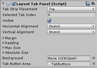
- Tab Strip Placement: This determines where the buttons controlling the tab visibility are placed relative to the content.
- Top – this will place the tab buttons above the content, laid out vertically.
- Left – this will place the tab buttons to the left of the content, laid out horizontally.
- Right – this will place the tab buttons to the right of the content, laid out horizontally.
- Bottom – this will place the tab buttons below the content, laid out vertically.
- Selected Tab Index: This is the index (starting at 0) of the currently visible tab. Changing this will change which tab is currently visible.
- Tab Button Area: This is set by default on the LayoutTabPanel prefab and should not be changed. It is the container the Tab Panel uses for the tab buttons. It is a child of the LayoutTabPanel, but will not become a tab.
LayoutTab
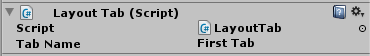 Each child of the LayoutTabPanel (except the Tab Button Area) will be given the LayoutTab component automatically. This is how the LayoutTabPanel keeps track of what tabs it has. It has one property that can be edited in the inspector: Tab Name. This will be the text in the tab button associated with this child.
LayoutTabPanelButton
By default, the LayoutTabPanel uses the TabButton prefab as the template for creating the tab buttons. This template can be changed. The Tab Button Area, the child named “TabButtons,” has an ItemsControl component that creates the tab buttons. Changing the Item Template on the ItemsControl to another prefab will change what gets created as a tab button.
LayoutTabPanelButton handles the click event for the tab button to change the LayoutTabPanel to the correct Selected Tab Index and should be on the prefab that is used for the tab button template.