
Videos:
Getting started video.
LayoutTable Demo
Layout Controls are Live! The goal of these controls is to simplify the creation of complex or dynamic user interfaces by having the UI elements place themselves based on the area available to them and respond to changes via data binding. Short descriptions and links to longer documentation for the layout components can be found at the bottom of this page. Support can be found in the forum. Currently the controls build on top of NGUI, but I am planning on updating the package with a set of controls that support Unity’s new GUI system when it releases.
At the core of this plug-in is an abstract base class called LayoutCapable. All controls involved in layout, such as LayoutStackingPanel and LayoutTable, inherit from this. There is also an implementation of LayoutCapable for display controls, like LayoutLabel and LayoutButton, so that they can be laid out properly. When layout occurs, the top level control – that is, the children of the NGUI Panel – will use the entire screen as its available area. Every child will be given the area available to it based on the various ways in which the controls perform layout.
All LayoutCapable implementers will have eight fields that can be edited in the Unity Inspector. The first of these is Visible which controls whether or not the control is shown. This should be used instead of toggling the objects enabled state.
I took a Box Model approach to layout, similar to how elements are laid out on a web page or in XAML. Three of the eight of the editable properties from LayoutCapable directly relate to the Box Model I implemented. Here’s a graphic of how you can expect controls to be laid out and size, notice that I do not include a border:
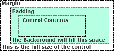
- Margin: Empty space around the control.
- Padding: Empty space between the edge of the border and the control’s contents.
- Background: This is one of the children of the control, probably a UISprite, that will be used as a background. It will be sized according to the amount of space used by the control, the margin, and the padding. Background is not required, controls will work just fine without this set.
The next two editable properties change how a control is placed within the space available to it:
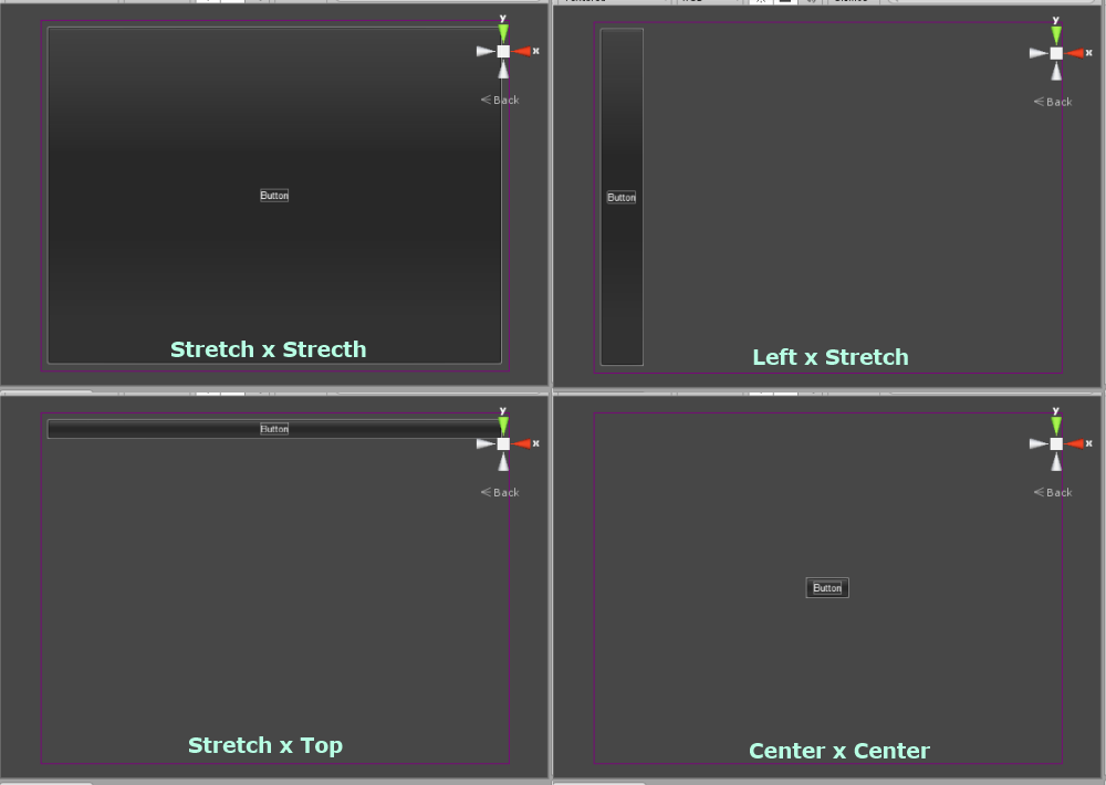
- Horizontal Alignment: This has four possible values: Left, Center, Right, and the default value Stretch. Stretch means that the control will take up all the space available to it. If this is set to Left, Center, or Right the control will take up the minimum amount of space required and will place its self in the corresponding location within the space available.
- Vertical Alignment: This has four possible values: Top, Center, Bottom, and the default value Stretch. This behaves the same as Horizontal Alignment, just in the vertical direction.
Below is an example of a button in different horizontal by vertical alignments with a margin of 10 pixels in all dimensions, left and right padding of 10 pixels, and top and bottom padding of 5 pixels :
The last two editable properties of LayoutCapable override the layout mechanisms:
- Max Size: If one of these values (width or height) is non-zero, it represents the maximum amount of space in that dimension that the control will use. If the control’s contents need less space than the Max Size, then the control will only use as much as is needed. If it is zero, it is ignored.
- Absolute Size: If one of these values (width or height) is non-zero, the control will use the value for the its size in that dimension, regardless of how big its contents are. If it is zero, it will be ignored.
Layout Controls comes with a bunch of implementations of LayoutCapable split into controls that perform layout and the visual controls that are the real content. Each of these has a corresponding Prefab that should be used in the creation of UIs. Here they are:
Perform layout:
LayoutStackingPanel – places elements next to each other
LayoutTable – places elements in rows and columns
LayoutTabPanel – places elements in tabs, with only one tab visible at a time
LayoutScrollViewer – places elements in a scrolling area
Visual:
LayoutLabel
LayoutButton
LayoutSprite
LayoutTexture
LayoutCheckBox
LayoutInput
LayoutSlider – NGUI 3.0.4 and later.
Miscellanious and Utility:
Bindable
DataBind
ItemsControl
ObservableCollection
UIStateManager
2 Responses to Layout Controls: An Overview