
LayoutButton is an implementation of LayoutCapable to give layout capabilities to buttons and is attached to an NGUI UIButton.
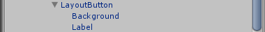
Just like a normal NGUI button, it has two children: a UISprite background and a UILabel for text. These need to be setup just like a normal NGUI button with the desired atlas, sprite, and font properties before they will display.
LayoutButton does not have any additional properties over LayoutCapable, and the prefab will come with the LayoutCapable Background property already set.
CommandButton and DelegateCommand
The LayoutButton prefab also has the Command Button component on it. This allows for binding to the action that happens when the button is clicked. The target path when using a command button in data binding should be Command. Command is of type DelegateCommand.
DelegateCommand is a class with two properties:
- Execute is an Action<object>, meaning it can be set to any void method with one argument of type object. This will be called when the button is clicked with the button as the argument.
- CanExecute is a Predicate<object>, meaning it can be set to any method that returns bool and has one argument of type object. This is called after the button is clicked but before Execute is called, and is called with the button as its argument. If this returns false, Execute will not be called.