
LayoutCheckbox is a LayoutCapable implementation for UICheckbox.
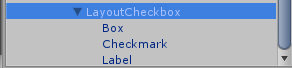
Since LayoutCheckbox uses a UICheckbox for display, the UICheckbox children need to be setup by giving the Box and Checkmark children an atlas and sprite and giving the Label child a font. The text of the checkbox is set in the Label, the Checkmark is the sprite that is shown when the checkbox is checked, and the Box is the sprite that is show as a background for the Checkmark.
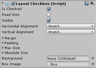 LayoutCheckbox has extra properties that can be edited in the inspector.
- Is Checked: this controls whether or not the checkbox is checked. This property is for DataBinding and will notify when it is changed by the user so that the data context will be updated. The path should be “IsChecked” when used in data binding.
- Read Only: this controls whether or not the checkbox’s state can be changed at run time. If this is true, then clicking the checkbox at runtime will not change whether or not the checkbox is checked. If it is false, clicking will toggle the checked state.
- Box Image: this is used by the component for calculating layout. It is set by default on the prefab and should not be changed.