
LayoutInput implements LayoutCapable for the UIInput control.
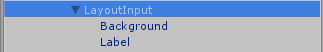
Just like a UIInput, LayoutInput has two children elements that will need to be set up. The label is the text that will be shown and will need to have the font property set. The background is the graphic for the textbox and will need to be set up with an atlas and sprite.
Note that the Stretch alignment behavior for LayoutInput is different than other controls. Currently, the background will only stretch horizontally and the height of the background will always be enough to encompass the text. I made this decision to keep LayoutInput in line with how textboxes work in other environments.
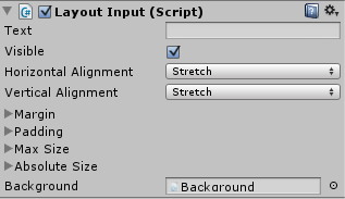 LayoutInput only has one additional inspector property on top of what it gets from LayoutCapable: Text. This is the text value of the input and allows for two-way data binding. When doing data binding for a LayoutInput, using the LayoutInput script as the Binding Target will result in two-way binding while using the UIInput script as the Binding Target will result in one-way from source binding.
The background property is already set on the prefab, and should not be changed.