
Note: LayoutSlider is only available in the NGUI 3.0 package.
LayoutSlider is an implementation for LayoutCapable designed to give UISlider layout capabilities.
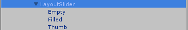
LayoutSlider has three child sprites that need to be set up for use. Filled is currently required and is the look of the filled in area of the slider. When the slider’s value is 1 the filled sprite takes up the entire slider and when the value is 0 it takes up no space. Thumb is the sprite at the leading edge of the slider. Empty is the sprite that is under the Filled sprite and shows through when the value of the slider is less than 1.
When the alignment for the LayoutSlider is set to Stretch, the behavior is different than the other layout controls. When it is placing its self it will only stretch in the direction that the UISlider script is set up to go in – horizontal or vertical. For example, when the UISlider script is set up to go horizontally, the slider’s width will become the available area’s width but it will maintain its height. The thumb size will never be changed.
LayoutSlider has five properties that can be edited in the inspector on top of what it gets from LayoutCapable:
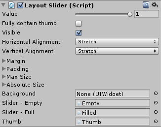 Value: this is the current value of the LayoutSlider. This property can be used for two-way data binding. When the LayoutSlider script is the Binding Target of a data binding using Value the binding will be two way, when the UISlider script is the Binding Target the binding will be one-way from source.
Fully contain thumb: this is a toggle that will determine how the empty sprite is sized. If this is checked, the empty sprite will be sized large enough so that the thumb fits completely inside it, otherwise the thumb will extend outside of the empty sprite’s area. Below you can see example images that show the difference between how the empty sprite is sized based on the value of Fully contain thumb.
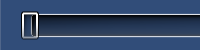
Fully contain thumb is false
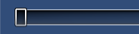
Fully contain thumb is true
Slider – Empty: This is the sprite that is shows in the empty part of the slider (value is less than 0). This is already set on the prefab and should not be changed.
Slider – Full: This is the sprite that is used for the filled part of the slider. This is already set on the prefab and should not be changed.
Thumb: This is the sprite that is used for the thumb. This is already set on the prefab and should not be changed.