
The LayoutScrollViewer is intended to provide scrolling functionality for its children if they exceed the space available to them. Normally if a control’s minimum size is larger than the area available to it, it will squish up against the right side or bottom of the screen. If the control is instead a child of a Scroll Viewer, scroll bars will appear and allow the content to be laid out fully and scrolled around.
This uses the UIDraggablePanel from NGUI to facilitate scrolling, which is on one of the children of the LayoutScrollViewer prefab named “Scrolling Area”. The children of “Scrolling Area” will be what is laid out and scrollable.
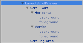 The Scroll Viewer requires some extra setup. Since it has scroll bars, the sprites for the scrollbar background and thumb need to be setup. Under the “Scroll Bars” child of the LayoutScrollViewer Prefab are the two scrollbars. Each of these has two children, one for the background and one for the thumb (foreground). These are just NGUI Sprites and use an NGUI Atlas.
The Scroll Viewer’s inspector has three properties in addition to what comes from LayoutCapable: Horizontal Scrollbar, Vertical Scrollbar, and Scrolling Panel. These are set by default on the Prefab and should not be changed.