
The LayoutTable places its children in rows and columns that can size themselves in various ways. A demo video can be found here. When a control is place in a table cell (defined by the row and column), it is given the entire area of the cell to layout in. This means that if multiple controls are in a single cell they will be placed on top of each other.

The row and column definitions can be edited in the inspector for a LayoutTable. The first thing to notice is that the rows and columns are indexed, starting at zero. In the header of each row or column definition is this index as a reminder. If there is more than one row or column one can be removed by clicking the ‘x’ in the upper right corner of the definition’s box.
Each definition has three properties to edit. Height and Width behave differently based on the Sizing Behavior chosen, and will be discussed in the description of the three possible behaviors.
Size Group will force the rows or columns that share the same value to have the same size. An example use for this would be to have statically created headers for a table with dynamically generated rows. To accomplish this you would use one LayoutTable with columns for the headers and an ItemsControl with a template that uses a LayoutTable. Making each column in both Tables share a unique Size Group will ensure that they are all the same width.
Sizing Behavior can be one of three values:
- Proportional (default): This will split up the available area evenly. When this behavior is selected, width and height determine what proportion of the space each row or column will get. A value of 0 is assumed to be 1. For example, if a LayoutTable has two rows both set to Proportional but one has a height of 2 and the other 1 (or 0), then the height 2 row will get 2/3 of the height available to the Table while the other will get 1/3.
- Auto: The row or column will size so that it is only as big as it needs to be to hold the content in it. Width and height have no effect when a row or column is using this sizing behavior.
- Absolute: This behavior will set the height or width of the row or column to exactly the number of pixels set in the Height or Width field.
LayoutTableElement
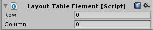
Children of a LayoutTable will automatically have a LayoutTableElement component. By default, a child of a LayoutTable will be placed in row 0, column 0. To place a child into a different row or column, simply change the row or column in the LayoutTableElement.