Layout Controls: Bindable and Data Bind

There is a lot to say about the theory behind data binding and the types of patterns you can use in developing with a UI that supports data binding. This is not going to address all of that, but I do suggest looking into the MVVM pattern. Data binding with the Layout Toolkit has two main components and there are a couple of supporting classes in the package.

Bindable Bindable Inspector 
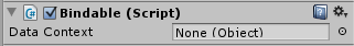
The Bindable component allows an object to have a Data Context. The Data Context is where any data binding gets its data from and is required for data binding to work. In the inspector it can be set to objects in the scene, or it could be set in code behind to any class. This is the source of data for data bindings.

This should be on most of the objects in your UI hierarchy even if a particular object does not have a data binding of its own. If the Data Context is null (not set) for a given object, it will look to its parent for a data context.  This bubbles up the hierarchy until there isn’t a Bindable component. This means that many times the data context only needs to be set once, at the top most Bindable.

Certain components, like ItemsControl or UIStateManager, will take care of automatically setting the data context on their children.

DataBind DataBind Inspector
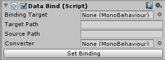
DataBind will set a property or field on a target to the value of a property or field on the data context. If the data context implements INotifyPropertyChanged it will keep the target field or property up to date whenever the property on the data context changes. If the target implements INotifyPropertyChanged, the binding will update the data context when the target changes. The “Set Binding” button can be used to make the binding work in edit mode after the necessary fields have been filled in. The main reason for this is to prevent lots of error messages while setting the fields in the inspector.

  • Binding Target (required): The object with the property or field you want the binding to set. Some example targets are UILabel, ItemsControl, or CommandButton.
  • Target Path (required): The name of the field or property on the BindingTarget to set. Example paths for the example targets could be “text”, “Items”, or “Command” respectively.
  • Source Path (required): The name of the field or property on the data context to get the value of. Both this and TargetPath support dot notation, which means you can put in a path to a variable just like you would in code. For example, if your data context is a Transform, the SourcePath could be set to “gameObject.name” to have the target get set to the name of the data context object.
  • Converter: this should be set to a component that implements ValueConverter (see below.) When the source data type on the data context does not match the target data type a value converter can be used. For example, if a control should have visibility set to false when the Length of an Array is 0, you could use a converter to convert the ‘0’ to ‘false’.

ValueConverter

ValueConverter is an abstract class that can be inherited from to provide conversions in data binding. It inherits from MonoBehaviour, so the usage is to implement ValueConverter and attach it to objects that have a DataBind component that will be using the ValueConverter implementation. ValueConverter has two methods:

  • Convert: this will be called any time data is being taken from the data context and being set on the target. After getting the data from the data context DataBind will call Convert on its converter and use the result when setting the field or property on the target.
  • ConvertBack: this is called whenever data is taken from the target and set on the data context. Just like convert, it will be called after getting data from the target and the result will be used when setting the field or property on the data context.

ViewModelBase

This class currently just implements INotifyPropertyChanged. It is a shortcut to inherit from this instead of implementing INotifyPropertyChanged for every class that will be a data context.

Posted in Layout Controls | Comments Off on Layout Controls: Bindable and Data Bind

Layout Controls: LayoutCheckbox

LayoutCheckbox is a LayoutCapable implementation for UICheckbox.

LayoutCheckbox Hierarchy

Since LayoutCheckbox uses a UICheckbox for display, the UICheckbox children need to be setup by giving the Box and Checkmark children an atlas and sprite and giving the Label child a font. The text of the checkbox is set in the Label, the Checkmark is the sprite that is shown when the checkbox is checked, and the Box is the sprite that is show as a background for the Checkmark.

LayoutCheckBox InspectorLayoutCheckbox has extra properties that can be edited in the inspector.

  • Is Checked: this controls whether or not the checkbox is checked. This property is for DataBinding and will notify when it is changed by the user so that the data context will be updated. The path should be “IsChecked” when used in data binding.
  • Read Only: this controls whether or not the checkbox’s state can be changed at run time. If this is true, then clicking the checkbox at runtime will not change whether or not the checkbox is checked. If it is false, clicking will toggle the checked state.
  • Box Image: this is used by the component for calculating layout. It is set by default on the prefab and should not be changed.
Posted in Uncategorized | Comments Off on Layout Controls: LayoutCheckbox

Layout Controls: LayoutButton

LayoutButton is an implementation of LayoutCapable to give layout capabilities to buttons and is attached to an NGUI UIButton.

LayoutButton Hierarchy

Just like a normal NGUI button, it has two children: a UISprite background and a UILabel for text. These need to be setup just like a normal NGUI button with the desired atlas, sprite, and font properties before they will display.

LayoutButton does not have any additional properties over LayoutCapable, and the prefab will come with the LayoutCapable Background property already set.

CommandButton and DelegateCommand

The LayoutButton prefab also has the Command Button component on it. This allows for binding to the action that happens when the button is clicked. The target path when using a command button in data binding should be Command. Command is of type DelegateCommand.

DelegateCommand is a class with two properties:

  • Execute is an Action<object>, meaning it can be set to any void method with one argument of type object. This will be called when the button is clicked with the button as the argument.
  • CanExecute is a Predicate<object>, meaning it can be set to any method that returns bool and has one argument of type object. This is called after the button is clicked but before Execute is called, and is called with the button as its argument. If this returns false, Execute will not be called.
Posted in Layout Controls | Comments Off on Layout Controls: LayoutButton

Layout Controls: ItemsControl

The ItemsControl component is used to dynamically generate other UI controls. It does not place the elements on its own, it only creates them and adds them as children. The ItemsControl prefab uses a LayoutStackingPanel to manage the placement of the items it creates. ItemsControl has two important properties: Items and Item Template.

  • Item Template: this can be set to a prefab in the inspector. When the ItemsControl creates its children, it will create an instance of this prefab.
  • Items: cannot be edited in the inspector, but can be used as a target in Data Binding. The ItemsControl will create one instance of the ItemTemplate for each item in this IEnumerable. If the created instance has a Bindable component, the item that the instance was created for will be set as the Data Context.

ObservableCollection<T>

ObservableCollection implements IEnumberable<T>, IList<T>, and INotifyPropertyChanged with an added CollectionChanged event. When an element is added to, removed from, or swapped in (via List[index] = ) the backing List, CollectionChanged is fired. When an item is added or removed from the backing list PropertyChanged is fired for the Count property.

If the Items property of an ItemsControl is bound to an ObservableCollection, the ItemsControl will attach to the CollectionChanged event and dynamically update the children (create or destroy) when items are added to or removed from the backing ObservableCollection.

Posted in Layout Controls | Comments Off on Layout Controls: ItemsControl

Layout Controls: Tab Panel

The Tab Panel is a control that ensures only one of its children is visible at a time. It creates a button for each child that controls which child is visible – clicking one of these buttons will show the child that is associated with it while hiding all other children. There is some required setup to use a LayoutTabPanel. There is a prefab named “TabButton” that is a LayoutButton, the Font and Background need to be set or the buttons will not display.

LayoutTabPanel Hierarchy

The LayoutTabPanel prefab will have one child to start with called “TabButtons.” This will not be given a tab, but is the element the Tab Panel will use for the placement of the buttons associated with each tab. Each other child of a LayoutTabPanel will become its own tab and will be given the area available to the Tab Panel except for the area required by the tab buttons. The tab control has three properties in the inspector in addition to what it gets from LayoutCapable.

LayoutTabPanel Inspector

  • Tab Strip Placement: This determines where the buttons controlling the tab visibility are placed relative to the content.
    • Top – this will place the tab buttons above the content, laid out vertically.
    • Left – this will place the tab buttons to the left of the content, laid out horizontally.
    • Right – this will place the tab buttons to the right of the content, laid out horizontally.
    • Bottom – this will place the tab buttons below the content, laid out vertically.
  • Selected Tab Index: This is the index (starting at 0) of the currently visible tab. Changing this will change which tab is currently visible.
  • Tab Button Area: This is set by default on the LayoutTabPanel prefab and should not be changed. It is the container the Tab Panel uses for the tab buttons. It is a child of the LayoutTabPanel, but will not become a tab.

LayoutTab

LayoutTab InspectorEach child of the LayoutTabPanel (except the Tab Button Area) will be given the LayoutTab component automatically. This is how the LayoutTabPanel keeps track of what tabs it has. It has one property that can be edited in the inspector: Tab Name. This will be the text in the tab button associated with this child.

LayoutTabPanelButton

By default, the LayoutTabPanel uses the TabButton prefab as the template for creating the tab buttons. This template can be changed. The Tab Button Area, the child named “TabButtons,” has an ItemsControl component that creates the tab buttons. Changing the Item Template on the ItemsControl to another prefab will change what gets created as a tab button.

LayoutTabPanelButton handles the click event for the tab button to change the LayoutTabPanel to the correct Selected Tab Index and should be on the prefab that is used for the tab button template.

Posted in Layout Controls | Comments Off on Layout Controls: Tab Panel

Layout Controls: Scroll Viewer

The LayoutScrollViewer is intended to provide scrolling functionality for its children if they exceed the space available to them. Normally if a control’s minimum size is larger than the area available to it, it will squish up against the right side or bottom of the screen. If the control is instead a child of a Scroll Viewer, scroll bars will appear and allow the content to be laid out fully and scrolled around.

This uses the UIDraggablePanel from NGUI to facilitate scrolling, which is on one of the children of the LayoutScrollViewer prefab named “Scrolling Area”. The children of “Scrolling Area” will be what is laid out and scrollable.

LayoutScrollViewer HierarchyThe Scroll Viewer requires some extra setup. Since it has scroll bars, the sprites for the scrollbar background and thumb need to be setup. Under the “Scroll Bars” child of the LayoutScrollViewer Prefab are the two scrollbars. Each of these has two children, one for the background and one for the thumb (foreground). These are just NGUI Sprites and use an NGUI Atlas.

The Scroll Viewer’s inspector has three properties in addition to what comes from LayoutCapable: Horizontal Scrollbar, Vertical Scrollbar, and Scrolling Panel. These are set by default on the Prefab and should not be changed.

Posted in Layout Controls | Comments Off on Layout Controls: Scroll Viewer

Layout Controls: LayoutTable

The LayoutTable places its children in rows and columns that can size themselves in various ways. A demo video can be found here. When a control is place in a table cell (defined by the row and column), it is given the entire area of the cell to layout in. This means that if multiple controls are in a single cell they will be placed on top of each other.

Table Inspector

The row and column definitions can be edited in the inspector for a LayoutTable. The first thing to notice is that the rows and columns are indexed, starting at zero. In the header of each row or column definition is this index as a reminder. If there is more than one row or column one can be removed by clicking the ‘x’ in the upper right corner of the definition’s box.

Each definition has three properties to edit. Height and Width behave differently based on the Sizing Behavior chosen, and will be discussed in the description of the three possible behaviors. 

Size Group will force the rows or columns that share the same value to have the same size. An example use for this would be to have statically created headers for a table with dynamically generated rows. To accomplish this you would use one LayoutTable with columns for the headers and an ItemsControl with a template that uses a LayoutTable. Making each column in both Tables share a unique Size Group will ensure that they are all the same width.

Sizing Behavior can be one of three values:

  • Proportional (default): This will split up the available area evenly. When this behavior is selected, width and height determine what proportion of the space each row or column will get. A value of 0 is assumed to be 1. For example, if a LayoutTable has two rows both set to Proportional but one has a height of 2 and the other 1 (or 0), then the height 2 row will get 2/3 of the height available to the Table while the other will get 1/3.
  • Auto: The row or column will size so that it is only as big as it needs to be to hold the content in it. Width and height have no effect when a row or column is using this sizing behavior.
  • Absolute: This behavior will set the height or width of the row or column to exactly the number of pixels set in the Height or Width field.

LayoutTableElement

LayoutTableElement Inspector

Children of a LayoutTable will automatically have a LayoutTableElement component. By default, a child of a LayoutTable will be placed in row 0, column 0. To place a child into a different row or column, simply change the row or column in the LayoutTableElement.

Posted in Layout Controls | Comments Off on Layout Controls: LayoutTable

Layout Controls: Stacking Panel

The Stacking Panel is the simplest of the layout controls. It just places each one of its children next to each other, one after the other.

LayoutStackingPanel InspectorLayoutStackingPanel has two properties to edit besides the ones inherited from LayoutCapable. The first of these is the stacking order of the child elements. At the bottom of the inspector for a LayoutStackingPanel is an area that lists all of the children of the control by name. They will be placed from top to bottom. The children can be moved up or down the list using the ‘^’ and ‘v’ buttons, respectively.

The Arrangement property controls how the children of the Stacking Panel are placed next to each other. By default, this is set to Vertical, which means that each child will be placed below the previous one. When in Vertical arrangement, the area given to each child for its layout will have the same width given to the Stacking Panel and the height will be the minimum required for the control to show its self. Setting this to Horizontal will cause each child to be placed to the right of the previous one. When in Horizontal arrangement, the width given to each child will be only as much as is necessary to display the entire child and the full height given to the Stacking Panel.

Note that the Stacking Panel will never give a child area to layout in that would put the child off the screen.

Stacking Direction

Posted in Layout Controls | Comments Off on Layout Controls: Stacking Panel

The Swapper – A Review

A friend gifted this wonderful indie game to me saying, “It’s a 2D platforming puzzle game with incredible visuals (it’s all claymation!) and an eerie story.” That sums up the game perfectly in one sentence. If you like Portal, you’ll probably like Swapper. In this review I give some mechanical spoilers and a brief story overview without too many details.

The Swapper does a great job taking a single mechanic and making a really solid game around it. The game gives you a gun that allows you to create up to 4 extra bodies that all move in unison and swap which body is your active body. Like Portal, this is all the game needs to create a full experience with some challenging puzzles. Another way to look at this is that the developers, Facepalm, did an incredible job with their level design. The environments perfectly compliment the swapper gun mechanic, nothing feels contrived. I was especially impressed with the subtle use of pits to limit the number of clones you have available for a given puzzle.

I found myself getting stuck at various points and coming back a day later only to solve the puzzle almost instantly. This may be a sign that some of the puzzle solving tricks were not introduced as smoothly as they could have been. I found myself getting a bit too used to solving puzzles in one way and needed that time away to open up my mind to a new technique. This isn’t necessarily a bad thing since I did keep coming back to figure out how to solve the next puzzle. However, taking a break from the game ruins the “a-ha” moments a bit, so I only had one really satisfying one of these in my play through.

The story is mostly told through a series of logs that you find throughout the ship, but they never give a full picture of what is going on. There is one voiced character, but I typically found her more confusing than anything else and never quite knew why I was following her instructions, especially given what I was reading in the logs. The art does a great job of complimenting the story and the developers may have intended all of this confusion, so I can’t say that these critiques are necessarily ‘bad.’ I did get the impression that the game was trying to explore some existential and psychological ideas but never really go to the point. Maybe I’m too dense.

The challenging puzzles definitely got the brain juices flowing to the point that I would recommend playing this game. I’m really impressed with developers who find one solid mechanic that they can make an entire game around, and Facepalm has really delivered on this. The Swapper gun is perfect for this purpose: generalized enough to allow for a lot of puzzle building but specific enough to be interesting.

Posted in Game Review | Comments Off on The Swapper – A Review

Game Reviews

As part of my site redesign, I’m going to start writing some game reviews for my blog. I have no idea how it’s going to go, but I think it’s a pretty good exercise in critically thinking about the games I’m playing. Hopefully this will translate into my own games, improving my designs and helping me to express my ideas more precisely. My goal is to write a review for every new game I play and hopefully go back and review some of my favorite old games.

I want to be able to talk about all aspects of each game I review, but I don’t think it is a good idea to give too many spoilers. This is going to be a balancing act. I think I want to lean towards more analysis than review, which will end up giving away at least game mechanic spoilers. To help you remember this I will be putting reminders at the beginning of posts describing how thorough the spoilers are. It might mean that what I have to say is only useful if you’ve played the game and I will probably play around a bit with my formatting of theses posts to try to make them the most useful. I’ll be posting my first one of these in the coming days.

Posted in Game Review | Comments Off on Game Reviews